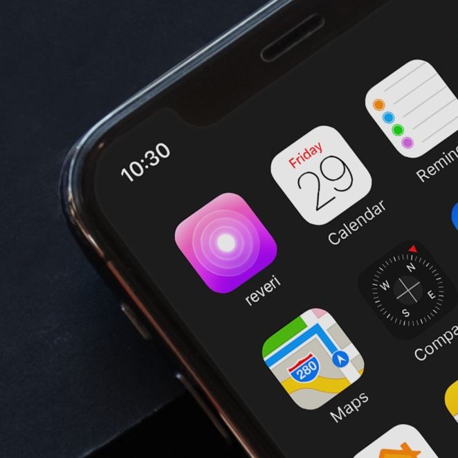

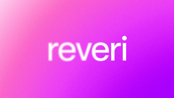
Self-hypnosis app reveri has launched a new brand identity crafted by Mother Design to mark its entry into the UK health-tech category.
Reveri was co-founded by world-leading psychiatrist Dr. David Spiegel, and Silicon Valley investor and technology leader Ariel Poler, starting in the US in 2020. Now, with an ever-growing community of ambassadors and advocates, reveri has its sights set on rapid UK and global growth.
Reveri approached Mother Design to create a new brand identity that broke down the traditional conventions of the wellness industry and communicated the brand proposition – defining self-hypnosis as an impactful new category.
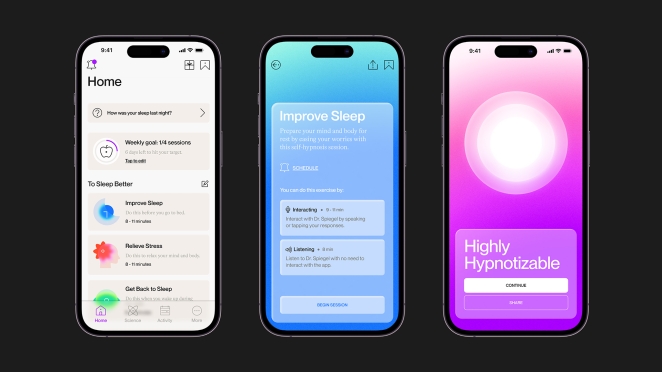
The resulting visual identity highlights the positive outcomes and tangible benefits of the discipline with clarity and immediacy, while also supporting the functionality and user interface of the product at the heart of the brand.
To learn more, we spoke to Harry Edmonds, Creative Director at Mother Design.
What was the brief for the rebrand?
reveri asked Mother Design to develop an aesthetic identity that would successfully communicate the brand proposition, whilst breaking down the traditional conventions of the wellness industry and define reveri’s entry into the self-hypnosis category in the UK.
We wanted to establish a visual language that was not only distinctive in the category but felt new across the broader design landscape. It also needed to avoid the tropes of self-help tools by diverging from the familiar signifiers of wellness such as pastel colour palettes, minimal art direction and approachable organic forms.
The new visual identity blends the philosophy of reveri as a brand with the functionality of the user interface as a product.
Describe the purpose of the brand and its target audience
Reveri is a clinically backed self-hypnosis app, created by world-renowned Stanford University psychiatrist Dr. David Spiegel and technology investor Ariel poler. It provides users with immediate and impactful relief for a variety of physical or mental health issues.
Determined to challenge the misconceptions of hypnosis, reveri aims to communicate the power of this incredible practice whilst dispelling the stigma. It’s an app for those who are looking for meaningful tools to make impactful change to their lives — so the audience is broad across all age groups.
A lot of people only find hypnosis as a last resort and we needed to create mass appeal, something that felt accessible and relatable, so that people would discover the options available to them earlier and not consider it a last resort.
What was your thinking behind the rebranding solution?
At the core of our approach was the recognition that self-hypnosis represents a state of heightened focus, rather than a loss of control. The strategic positioning of reveri sets out to reshape the narrative surrounding self-hypnosis, encouraging a fresh perspective that recognises its inherent value and power as a tool for personal empowerment and growth.
By challenging prevailing stereotypes, reveri aims to break free from the limitations imposed by societal stigmas and negative connotations, and reframe self-hypnosis as an effective, go-to tool with immediate results.
The visual design is built around the concept of clarity and focus, using it to define the entire brand world and permeating all aspects of the user experience; from the in-app interface to reveri’s own channels such as website and social. It is conveyed through blur treatments across the logotype, gradients in the colour system, and the use of extreme depth of field in art direction.
How did the initial pitch/brainstorming phase go?
We knew immediately that reveri was a compelling proposition, and the creative territories phase threw up multiple possibilities. We looked at various sources for inspiration, from brain scans to neural pathways to medical journal-style manuals to name a few.
Ultimately, we got to the concept of focus and realised, one; just how fundamental it was to self-hypnosis and the success of the exercises and, two; how naturally the concept flexed across all the touchpoints and the user journey.
Hearing Dr. Spiegel explain the metaphor of how hypnosis is similar to zooming in on a picture and seeing the incredible detail of a very specific area while becoming less aware of the surrounding context was an analogy that became the key inspiration for the entire brand world.
For me, the exciting part of ideation is identifying that red thread that we’re all hunting for — a relevant and distinctive concept that we can pull across every touchpoint. When the team is motivated and energised by something to the extent that they’re naturally suggesting significant builds and broader possibilities you know you’re in the right space.
Validated when the client responds with equal enthusiasm; that we understand them, their product and what they’re trying to achieve, that they become just as invested in the creative as we are.
Did you learn anything new during the project?
Firstly, that I’m highly susceptible to hypnosis! It’s an emerging category and previously my understanding of hypnosis is one that I’m sure is familiar to most people – a more performative practice that’s got a bad reputation, often tied to thoughts of loss of control or being publicly embarrassed.
I’ve found that clinically backed hypnosis is a world away from this and is in fact about focusing the mind and gaining control.
What was the biggest challenge? How did you overcome it?
The biggest challenge was in creating the supporting mark for the logotype — to reflect the same themes and feel like it was a part of the wider visual language. The logotype was already communicating the concept so well, we were struggling to find solutions that were compatible and looked like they belonged.
Our solution is the ‘reveri beacon’ – which really felt like an authentic part of the wider brand world and expanded on our concept of focus. With self-hypnosis often seen as a last resort, the beacon is also a symbol of light at the end of the funnel.
What kit/tools/software were used to create it?
We used a mix, but predominantly we worked in Figma which meant the transition from design into UI/UX was seamless — it’s a such a versatile tool and the design team and client product teams love it.
What details are you most proud of any why?
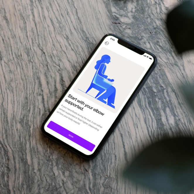
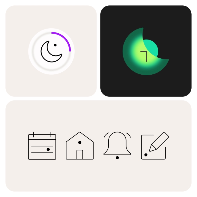
The fact that we carried the concept of ‘focus’ across everything but in different ways, striking a balance so nothing felt like overkill – from the photography, that’s shot with a long lens and shallow depth of field for emphasis between the subjects and their surroundings; to the iconography and illustration that reference ‘points of focus’; and of course the logotype, which resolves to clarity from a blur treatment and is set in lowercase to put emphasis on the ‘tittle’ (the dot above the i).
What visual influences fuelled your solution?
It’s almost quite cinematic in style — lots of lens treatments and depth of field informing the outcome and a sense of ‘pulling focus’. I love film and photography, so it was great to bring some of that influence into the work — the motion in particular is incredibly seductive.
I’m really proud of what the team created with the iconography and illustration too – with each icon having a focal point, further threading the idea of focus and clarity through every element of the identity.
What would you do differently if you could do it over again?
Honestly, nothing! Rather than changing anything, I’m more excited about the possibilities of what we could do in the future partnering with reveri.
There are still plenty of ways we could bring the brand world to life even further, for example with art direction and additional motion work as well as how our brand system would evolve to incorporate the use of sonics.